
Awards Voting UX
I was invited to collaborate as UI/UX Designer for the r/anime community on Reddit as part of their annual Anime Awards voting. This project was entirely volunteer based, and I was the sole designer.

About
The r/anime awards is an annual project run by volunteers for a community of 3 million subscribers, separated into a community vote and a jury vote to best showcase everything the year has to offer. The event aims to allow its many subscribers to quickly and smoothly search for and nominate their favorite shows, characters, and voice actors across 22 categories.
Problem
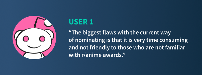
Users felt that the previous site’s voting process was tedious, confusing/unfriendly to navigate, and visually boring, leaving them unsatisfied with their experience. Users were often confused about how many entries they were supposed to nominate, or how many categories they needed to vote in. They also felt that it was difficult to navigate to and from different categories, especially if they wanted to change selections.


Solution
Redesign the voting process of the site to be more visually appealing, while revamping the experience to be more mobile-friendly and allowing users to seamlessly navigate between categories to vote and easily make changes to votes if needed.
Challenges
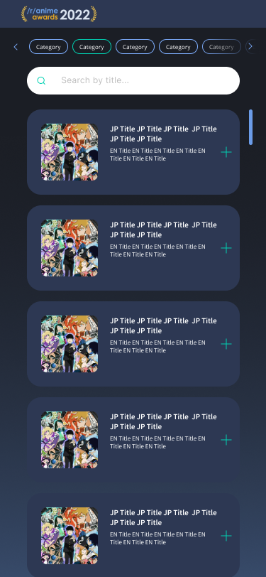
Due to the number of categories, the biggest priority was to find a way to save and maximize vertical real estate on the screen, as well as condense user flows to be more intuitive. It was also imperative to create a better mobile experience to display all nomination options and categories, as a majority of users voted from their mobile devices.
Role
UI Design: Visual design, concepting, ideation
UX Design: User research, journey mapping, wireframing, prototyping, iteration
Tools
Figma
Although I was unable to conduct user interviews, I conducted my research by reading through threads on last year’s awards event and collating the feedback through there. The most common pain points I encountered was that users felt confused by vague requirements and frustrated by a long voting process that wasn’t friendly or intuitive to interact with.
There were several requirements that posed a challenge in solving the UX problem—namely, the number of categories and moderators wanting a way to encourage users to nominate multiple entries in each category, despite users only needing to vote for one to complete that category. The number of categories would be a challenge for mobile screens especially, due to the limited amount of screen real estate.
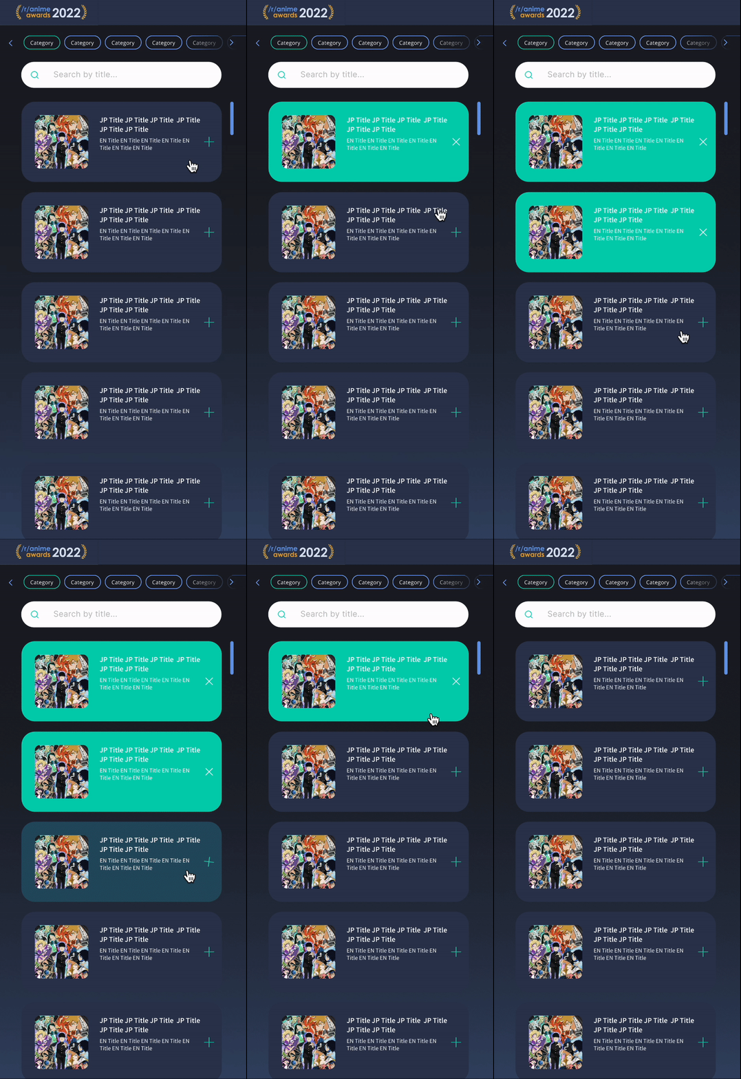
User flow through selection

Inactive, no selection
Active, no selection

Selection complete
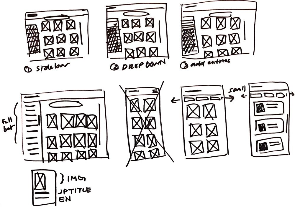
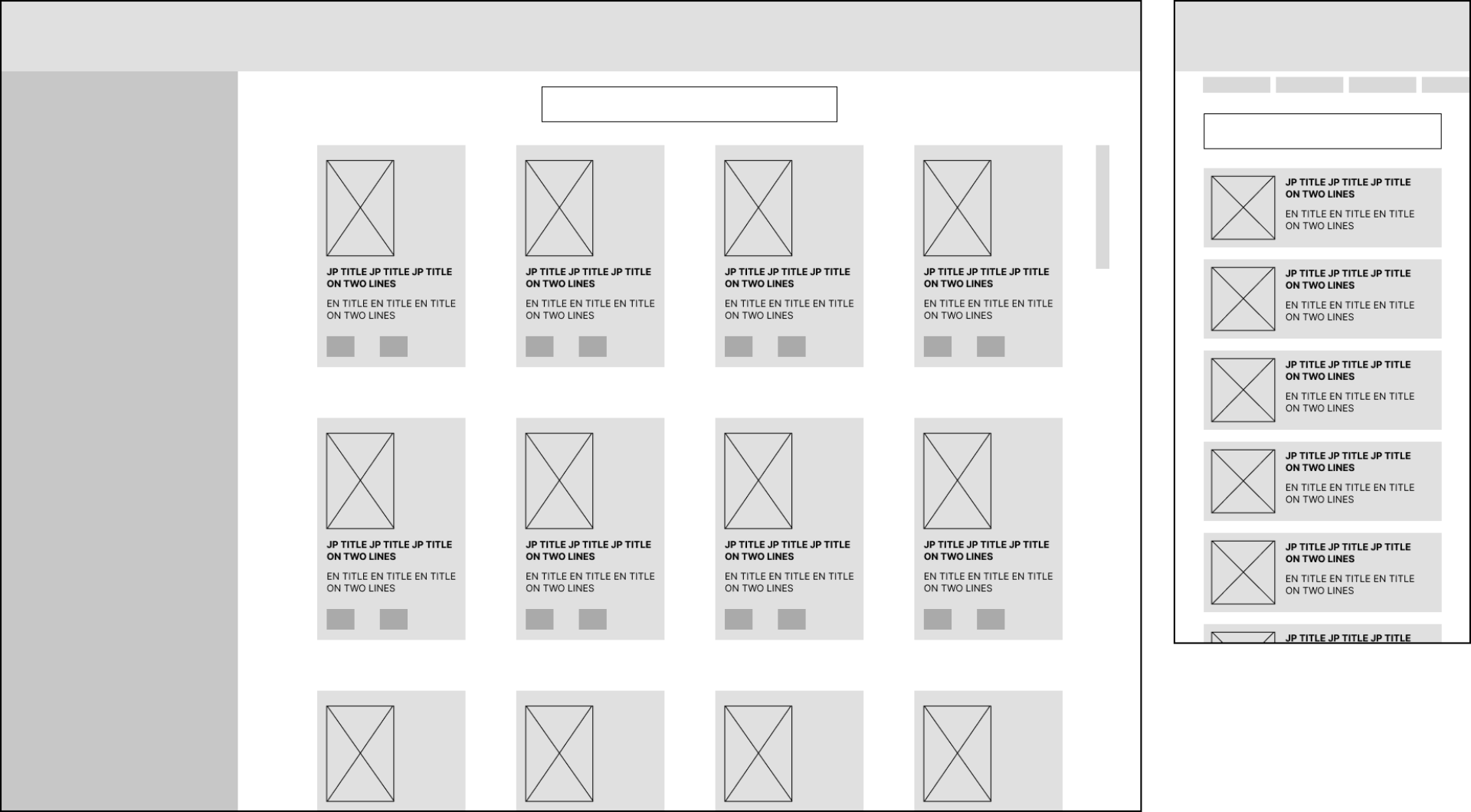
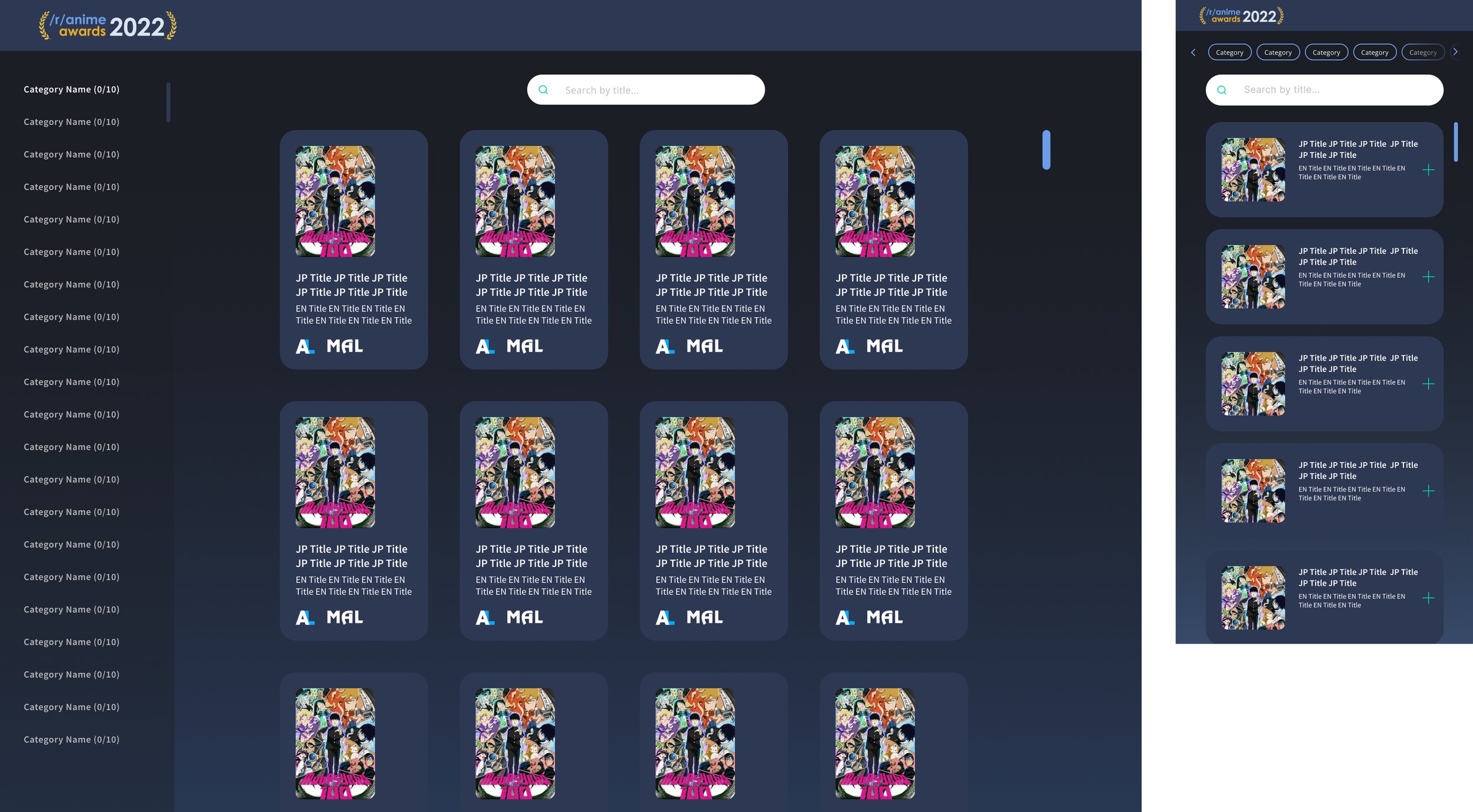
After discussing low-fidelity wireframes with the developer, I moved forward with more Figma wireframe iterations of the chosen concept before creating the high-fidelity prototype. The categories were condensed into a sidebar on the left-hand side with a scroll bar if needed, and different states to indicate inactive, hover, focus, and completed states that would let the user better keep track of where they were in the voting process. Once a user selects an entry in any category, the category name would turn green to indicate completion. All selected entries would jump to the beginning of the list for users to easily see and deselect if needed.
After feedback from the moderator team, we added a progress bar into the voting process to help our users clearly see their overall progress in voting. Above are the final live versions that users were presented with when voting in this year’s event.
The live demo can be viewed here and accessed by logging in with a Reddit account. Thank you for viewing!
